Colour has the ability to engage us and help to convey the right message, it also can be a bit of a turn off when not applied in quite the right way.
As such an impactful element within your brand identity, colour choices deserve a decent amount of thought and consideration given to them.
In this month’s edition of Colour Theory in Branding, let’s explore the colour red, and the deeper meanings it can have.
Red Colour Psychology
In studies red has been shown to increase heart rate and blood pressure. It’s also been found to be the colour that is most likely to affect our appetites, so it’s not surprising that red is used in such a huge amount in the food industry.
The colour red is often associated with love, confidence, adventure and power.
With some negative associations being danger, dominance and aggression.
But it really depends on the shade or tone of the red which is used, as that is what helps to evoke these feelings.
For example burgundy has an air of sophistication, and luxury, whilst crimson has an element of excitement and passion.
Dark Reds in Branding
Black cherry, burgundy and claret have a feeling of luxury and elegance, they are confident and intelligent.

Bright Reds in Branding
Carnelian, Fiery Red and Venetian red ooze passion and excitement. They’re vivid and strong

Soft Reds in Branding
Soft reds are still striking, just not quite so intense as their brighter variations. They may help to convey a quieter, more refined confidence

Brands That Use Red
Red is another very popular brand colour, with a lot of entertainment and food industries using them (excitement and appetite), with burgundy definitely being used for more refined spaces, including beauty and educational institutes.
Red Bull and Netflix have gone for a bold red that conveys energy and thrill seeking, whilst
Rare Beauty and Charlotte Tilbury have a deep burgundy that conveys luxury and refinement.





Crafting your unique brand vibe
When we work with colour in branding, we look at the different personality traits or feelings that the brand is wanting to express, we can then select multiple colours to help create a unique brand vibe, that will help to set you apart.
Combining colours like this, helps to create a brand identity that feels right, and reinforces your brands message.
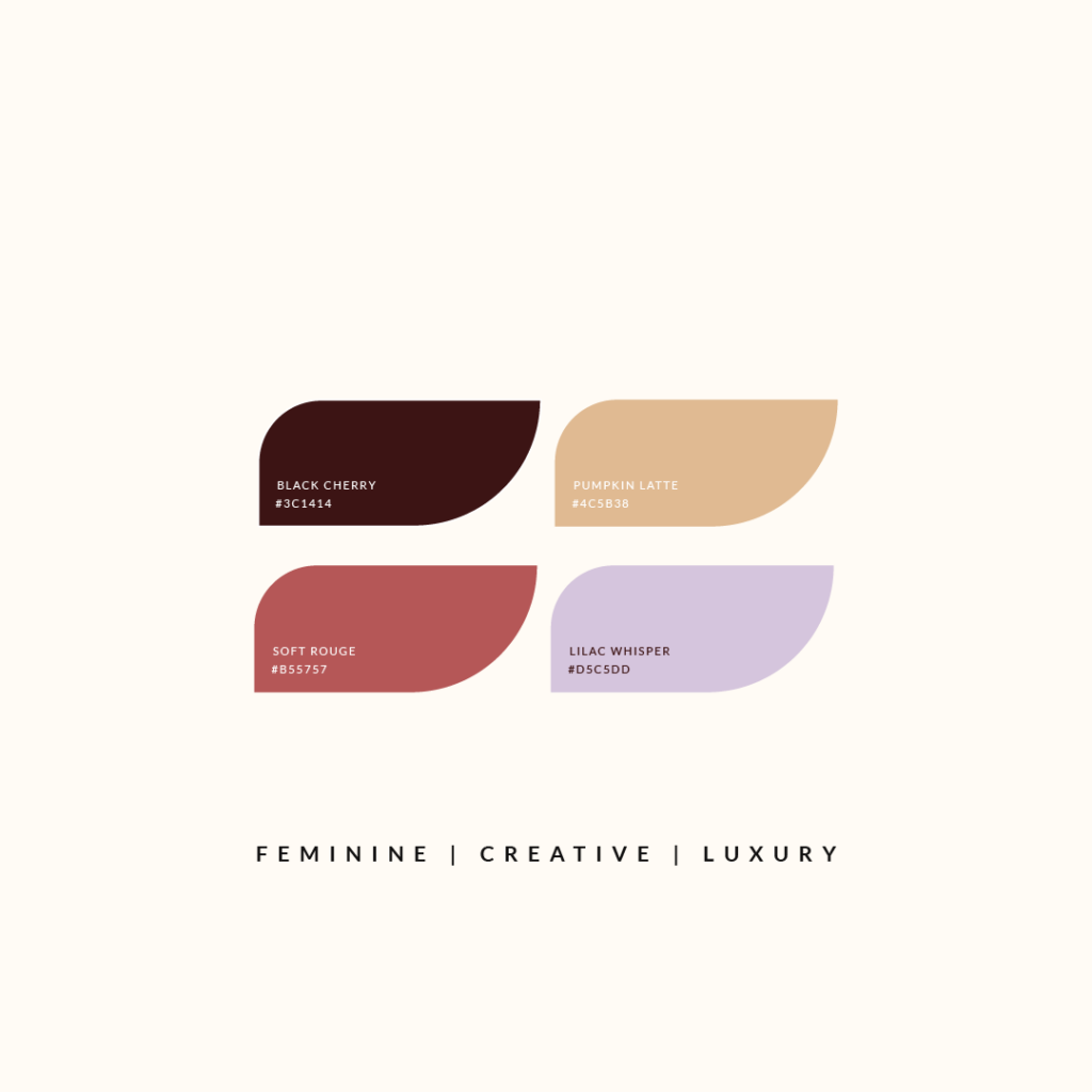
The Black Cherry and Soft Rouge paired with Pumpkin Latte and Lilac Whisper create a feeling of feminine luxury with a creative edge
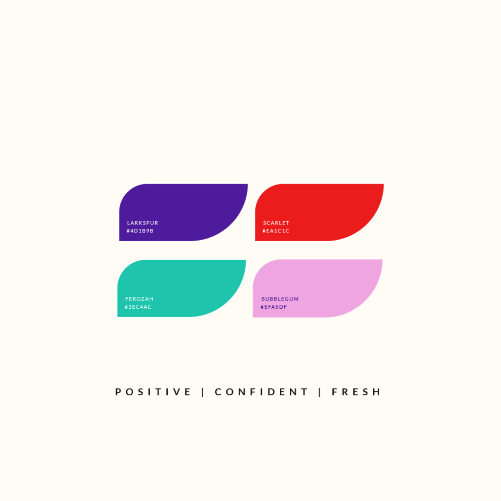
The brightness of the Larkspur and Scarlet, paired with this gorgeous Ferozah Green and Bubblegum Pink create a Positive, Confident and Fresh feel

This combination of Midnight Blue and Cranberry, paired with Lichen and Clay has a much more grounded feel to it.
Is red right for your brand?
If it’s important to communicate that your brand is confident, adventurous, assured, powerful, sophisticated, passionate, luxurious, or intelligent, the colour red is definitely worth considering.
Red could be a good fit for your brand depending on the values and message that are core to your business. This where it’s important to get clear on your brand as whole, not just pick a colour you like, but gain clarity on the bigger vision, how things fit together and the strategy behind your brand.
It’s good to explore your options, and find something that really feels right.
If you would like some help finding the right look and feel for your brand identity, do reach out, I would love to help you through the process.
Yes, I’m ready for The Gentle Shift
Sign up to get instant access to The Gentle Shift, a resource library to discover what an aligned brand looks like for you
You just need space to grow at your own pace
you don't need to rush things...
Branding and Showit web design for creatives and small businesses fuelled by passion and purpose.
Based in Scotland, proudly serving clients worldwide.
The Gentle Shift
Access the library
