
Colour has the ability to engage us and help to convey the right message, it also can be a bit of a turn off when not applied in quite the right way.
As such an impactful element within your brand identity, colour choices deserve a decent amount of thought and consideration given to them.
In this month’s edition of Colour Theory in Branding, let’s explore the colour green, and the deeper meanings it can have when used in your brand.
Green colour psychology
Studies have shown that green has a calming effect, helping to reduce stress and anxiety, it’s also said to improve focus, and creativity. This could be because green is a colour predominant in nature that it has this effect on us and our wellbeing.
The colour green is often associated with nature, harmony, balance and growth.
With some negative associations being envy or jealousy.
But it really depends on the shade or tone of the green which is used, as that is what helps to evoke these feelings.
For example racing green has an air of luxury and excellence, whilst lime green has an element of energy and youthfulness.
Dark greens in branding
Racing green, dark forest and phthalo have a feeling of luxury and elegance, they are stable and grounded, so can also work well for brands rooted in nature.

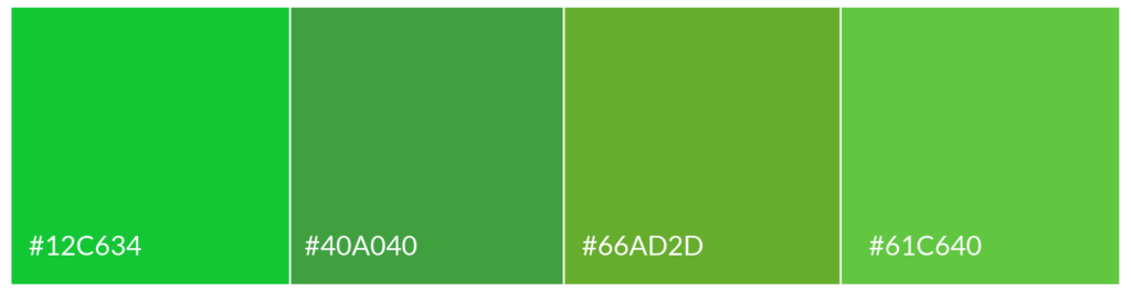
Bright greens in branding
Lime green, apple, and spring green are vivid and fresh, enthusiastic and creative.
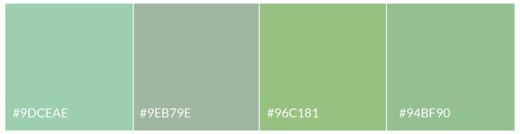
Light greens in branding
Light greens like sage, mint and seafoam can feel gentle, serene and calm.
Brands that use green in their visual identity
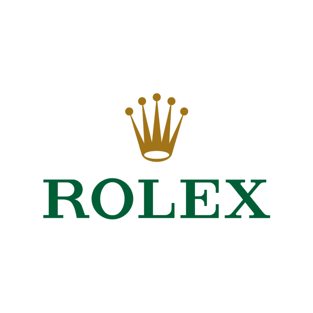
Green is another widely used brand colour, with a lot of environmental industries using them, dark green gives an air of luxury for Rolex, but its also quite grounding with The Body Shop, Wholefoods and Starbucks. There’s a definite youthful, fresh energy with the vibrant green for Disney XD and Spotify.
Crafting your unique brand vibe
When we work with colour in branding, we look at the different personality traits or feelings that the brand is wanting to express, we can then select multiple colours to help create a unique brand expression, that will help to set you apart.
Combining colours like this, helps to create a brand identity that feels right, and reinforces your brands message.
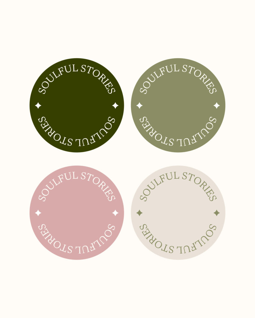
The example below was created for a Lizzie, a copywriter for soulful business owners. Core themes that came up before we started the design phase was being in nature and authentic, down-to-earth copy that flows with the seasons of life and business, and she described her soul clients as gentle, slow living, in tune with the seasons. All of these points helped to determine the use of green as one of her primary brand colours.
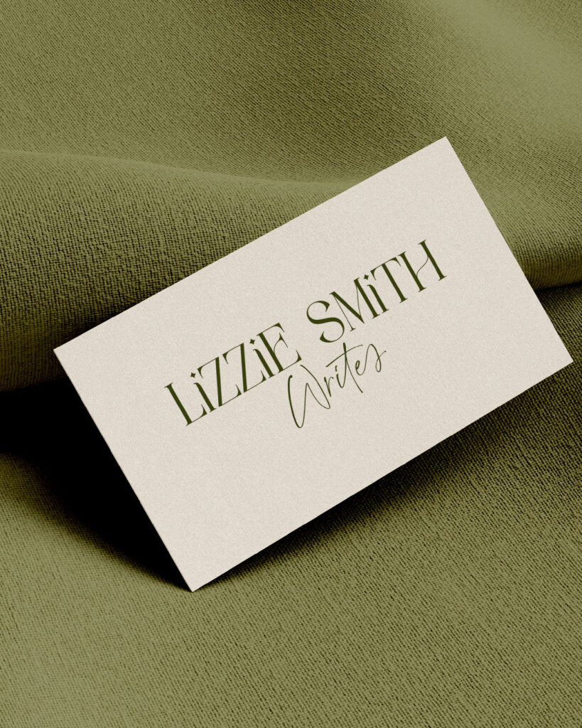
We paired the dark forest green, with a beautiful sage and a pop of complementary dusky rose pink and more neutral stone.
Is green right for your brand?
If it’s important to communicate that your brand is grounded, natural or health related, or maybe you want to convey heritage, elegance or stability, then using green in your branding is definitely worth considering.
Green could be a good fit for your brand depending on the values and message that are core to your business. This where it’s important to get clear on your brand as whole, not just pick a colour you like, but gain clarity on the bigger vision, how things fit together and the strategy behind your brand.
It’s good to explore your options, and find something that really feels right.
If you would like some help finding the right look and feel for your brand identity, do reach out, I would love to help you through the process.
Cover image by Cátia Matos on Pexels
Yes, I’m ready for The Gentle Shift
Sign up to get instant access to The Gentle Shift, a resource library to discover what an aligned brand looks like for you
You just need space to grow at your own pace
you don't need to rush things...


