We respond to colour on an unconscious level, it makes us feel something!
So when it comes to your brand identity, choosing certain colours can help to communicate and reinforce attributes that are important for your brand.
Colour plays a huge role in initiating a connection, in this series I’m sharing a bit if the psychology around the different colours.
Let’s kick of the series with what is said to be one of the most popular colours, blue.
Blue Colour Psychology
Blue is all around us, from the bright blue sky, to the deep blue sea, the earth is covered in beautiful blue, its no wonder it’s a favourite among many.
But how does it make us feel?
Studies it has shown to have a calming effect, actually reducing our heart rate, maybe this could be due to the fact that we are surrounded by it in our daily life, as green also seems to have this effect.
It is has a very traditional, conservative and trustworthy feel to it.
It is logical, competent, stable and reliable.
Calming, soothing and reflective are also some of the feelings also associated with the colour blue.
But it really depends on the shade or tone of the blue which is used, that is what helps to evoke these feelings.
Dark blues in branding
Dark blue, deep navy and petrol have a very elegant feel to them, and could be excellent alternatives to black. They have an intelligent, traditional and trustworthy feel to them.

Bright blues in branding
Bright blues on the other hand can give a modern feel, they are communicative and focused. They would also need a darker tone within their brand colour palette.

Light blues in branding
Light blues give a calm and soothing feel, they are tranquil and peaceful.

Businesses that use blue
Blue is one of the most popular colour that many brands to use, this study shows 37% of fortune 500 businesses use blue in their logo. Many banks and financial institutions use blue including Visa, PayPal and American Express, which isn’t surprising as they want to convey security, confidence and trust.
Gap, Estée Lauder and Dove use a dark blue shade, which adds a feeling of elegance and reassuring quality.






Crafting your unique brand vibe
When we work with colour in branding, we look at the different personality traits or feeling that the brand is wanting to express, we can then select multiple colours to help create a unique brand vibe, that will help to set you apart.
Combining colours like this, helps to create a brand identity that feels right, and reinforces your brands message.
These examples show how you can use blue alongside other colours to create completely unique vibes.
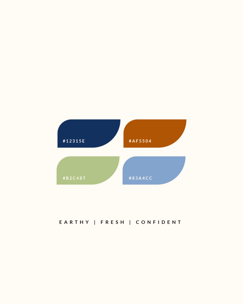
The dark blue, paired with a deep rust and fresh green, help to convey an earthy, fresh and confident feel
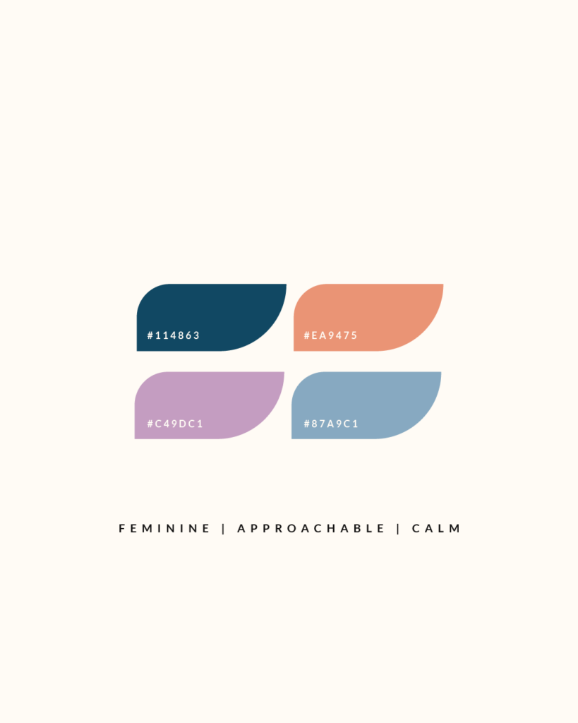
A dark grey blue, paired with a coral and lavender help to convey a feminine, approachable and calm feel
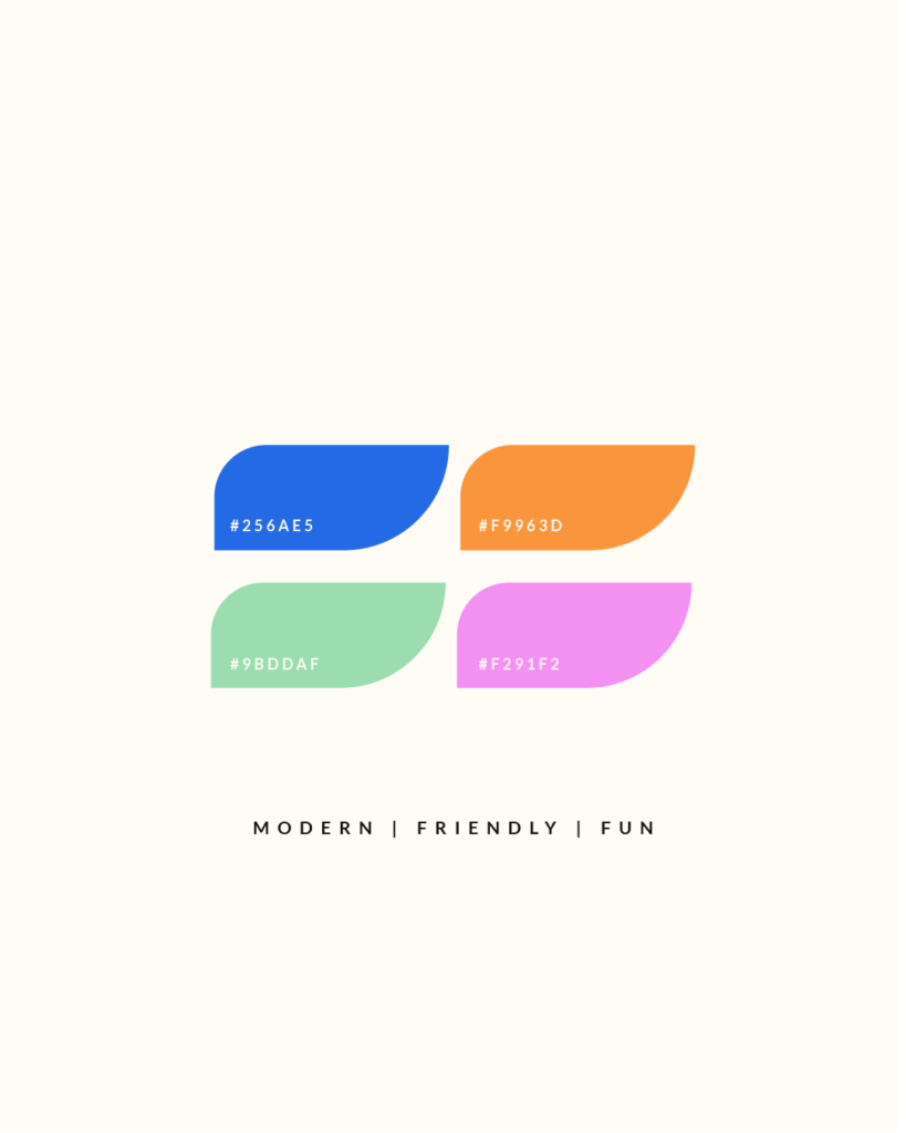
This bright blue and orange, paired with the mint green and fluro pink provide a modern, friendly and fun feel
Is blue right for your brand?
If it’s important to communicate that your brand is trustworthy, logical, reliable, focused, calm, confident, competent, stable, serene or reflective, it is definitely worth considering.
Blue could be a good fit for your brand depending on what your brand values and your core message, this where it’s important to get clear on your brand as whole, so you can gain clarity on the bigger vision, and how things work together.
Just because blue is popular, doesn’t mean its automatically a good choice for your brand. It’s good to explore your options, and find something that really feels right.
If you would like some help finding the right look and feel for your brand identity, do reach out, I would love to help you through the process.
Yes, I’m ready for The Gentle Shift
Sign up to get instant access to The Gentle Shift, a resource library to discover what an aligned brand looks like for you
You just need space to grow at your own pace
you don't need to rush things...
Branding and Showit web design for creatives and small businesses fuelled by passion and purpose.
Based in Scotland, proudly serving clients worldwide.
The Gentle Shift
Access the library
