Spring is in full bloom and there are little glimmers of possibility, reminding us that Summer is on its way. In a new series that I’m starting here on the Kindred Calling journal, I’m sharing a selection of colour palettes inspired by the month. Kicking off the series with May, this month’s colour palettes all have quite a vibrant feel to them, they’ve got a shot of energy that urges us to get outside and enjoy the brighter, warmer days.
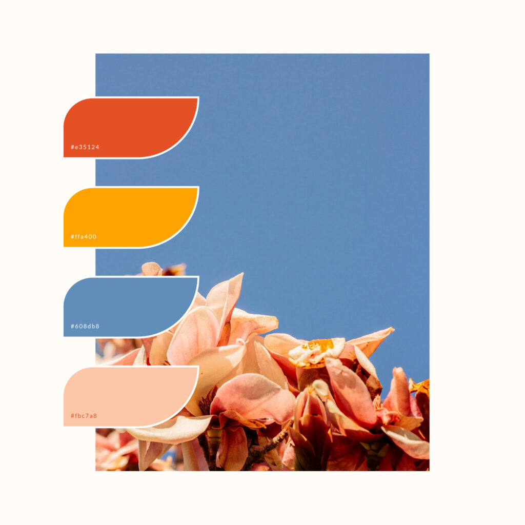
Photo by Sedanur Kunuk from Pexels
I spend a lot of time looking up into the blue sky and blossoming trees. This image really caught my eye and sums up how I spend Spring days.That blue is just so dreamy paired with striking orange and mango yellow and the gentle peach, such a beautiful combination.
Orange #E35124 | Mango #FFA400 | Sky #608DB8 | Peach #FBC7A8
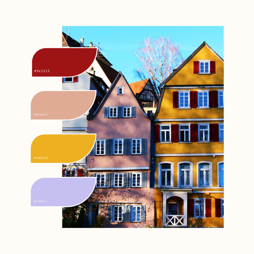
I can imagine walking down the road and spotting these beautiful homes, drawn in by their pops of colour. A row of colourful houses, playing with shadows, This is a slightly toned down vibrancy to it, with the dark red, dusky peach and sunny yellow being slightly more muted, but that pop of purple injects the palette with a fresh energy, like palma violet ice cream.
Dark red #9E1315 | Dusky peach #DFAA93 | Sunny yellow #EDB121 | Palma Violet #C6BFF1
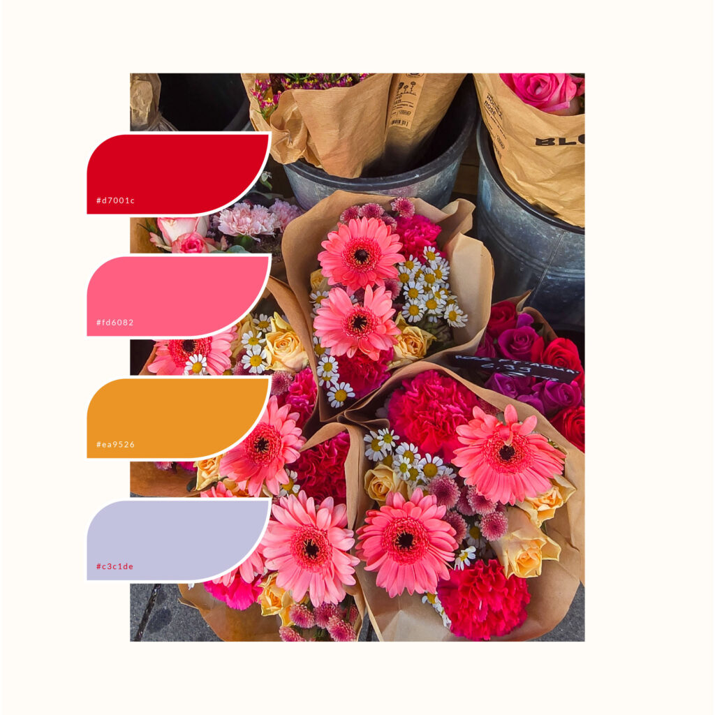
Photo by Nicole Kießling from Dupe
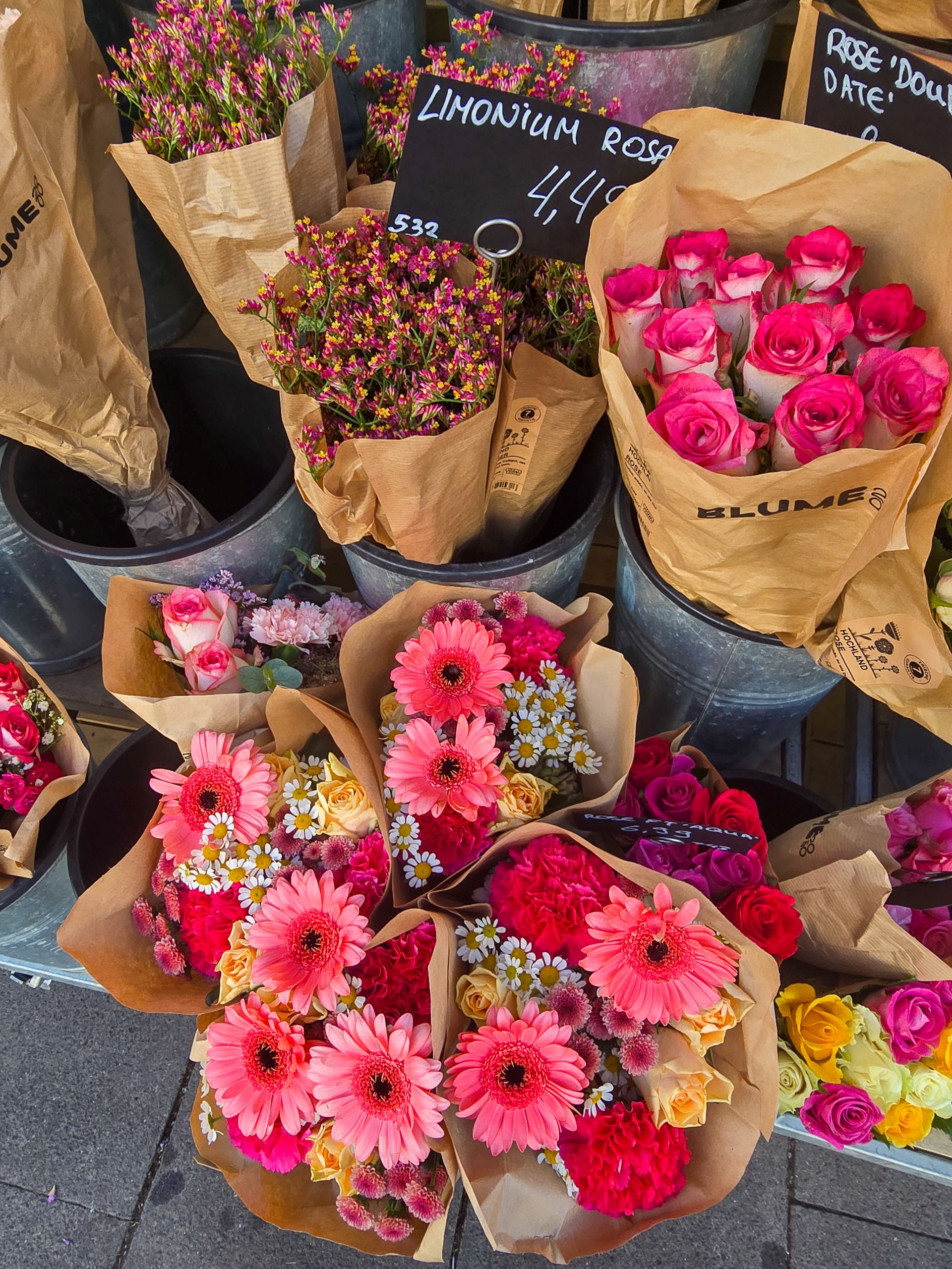
This image just sums up the joy of a fresh bouquet of pink flowers, in fact let this be a reminder that yes you should defo buy yourself some gorgeous florals next time you’re popping to the store ❤ The gorgeous pink and red combo, paired with the beautiful orange will always make my heart skip a beat, and the lilac adds a subtle twist to the mix.
Cherry red #D7001C | Bubblegum pink#FD6082 | Sunset orange #EA9526 | Lilac #C3C1DE
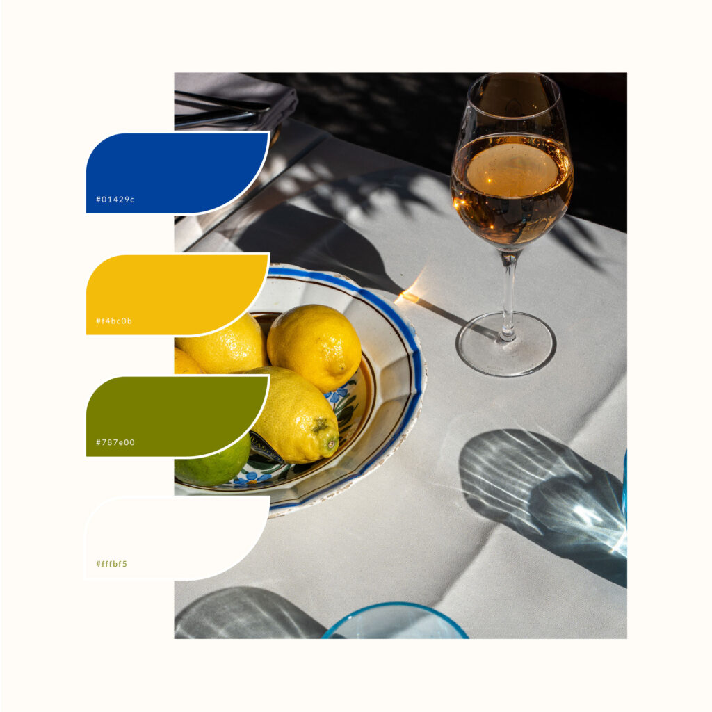
Photo by Isla Pearson from Dupe
I’ve not been to the south of France before but I reckon this could be how it feels. This is giving French bistro vibes,sitting in a shaded spot on the Côte d’Azur, looking out onto the mediterranean sea. With that intense vibrant blue, citrus hues and crisp cotton, yes please!
Cobalt blue #01429C | Lemon #F4BC0B | Lime #787E00 | French Cotton #FFFBF5
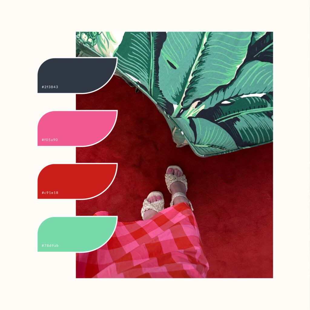
Photo by Lauren Hemmert-Jensen from Dupe
I’m a sucker for hot pink and red, it just has something so alluring about it. The intense boldness of both colours, some may find it too much, but to me it’s so energising. This palette it’s paired with navy blue with a touch of slate and that contrasting mint. Such a vibe.
Slate Navy#2F3843 | Hot pink #F05A90 | True red #C91E18 | Spearmint #78D9AB
Yes, I’m ready for The Gentle Shift
Sign up to get instant access to The Gentle Shift, a resource library to discover what an aligned brand looks like for you
You just need space to grow at your own pace
you don't need to rush things...


